

Company Logo
Company name containing
our thoughts
Our company has continued to support society through a wide range of business activities.We have decided to name the company "SAAF", an acronym that stands for Support As A Foundation, with the aim of further fostering a sense of unity throughout the group and being a stable, long-term supporter of society going forward.
Thoughts contained in the tagline
Since our establishment, our company has continued to evolve in response to the rapidly changing business environment. The new SAAF Holdings would like to contribute to the society in which we live through the "steadfastness" that supports the social infrastructure that we have cultivated up until now and the “flexibility” that allows you to change as needed. This idea is contained in our tagline: "Supporting society in a flexible manner.
Thoughts contained in the logo design
The spiral motif used in the logo forms the initial "S" of SAAF, and has a high affinity with the sound of "surf" in the company name, and conveys an image of freshness and sincerity. It also expresses how synergies are created by combining various businesses. Furthermore, the orange color represents the founder's thoughts and gives a bright, energetic, and active impression.
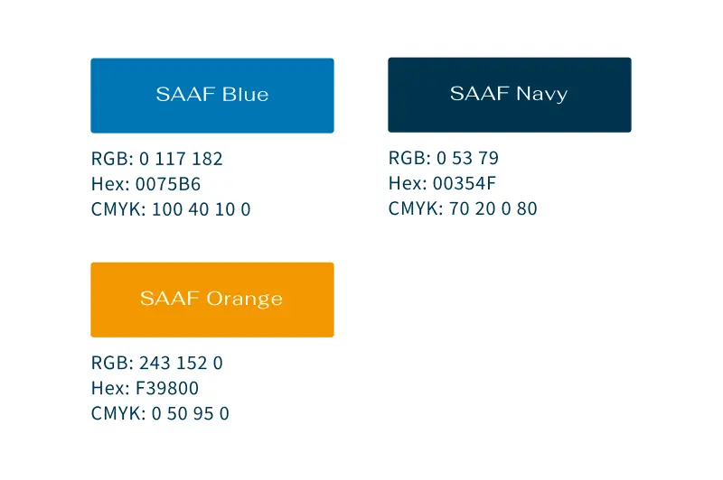
Brand color
The main color 'SAAF Blue' symbolizes trust and freshness and expresses SAAF's integrity and reliability. The base color of SAAF Navy is a deep shade that conveys solidity and professionalism, emphasizing the company's professionalism. The accent color "SAAF Orange" was the color used before the renewal, and it expresses the company's bright, energetic and active attitude while retaining the lingering thoughts of the founder.
